This came out of a discussion I had with a colleague regarding my likely termination on Dec 8th. Since said termination will result in what might be significant disruption to some number of projects, I have gotten the “it’s pretty selfish not to take one for the team” talk. During the course of one of those that was much less in that line and much more in vein of curiosity regarding why I would make such a decision, beyond the philosophical and ethical considerations, I was attempting to make a utilitarian, practical case as well. Given the quality and reliability of all reporting on vaccine efficacy and safety, I was looking for a small example with simple data. I wrote up the following for this colleague and figured, since the work was already done, I’d throw it up here.
The following is based on a simple pull of data from the NHS response to a UK FOIA request to a single hospital unit for the first half of 2021. I attach a screen shot of the letter and the data; I didn’t insert the screen shot as the formatting was shite. For this quick analysis, I’m only looking at the month to month data in the last two tables. These data cover the first half of 2021, from roughly the start of a widespread vaccination program in the UK to the end of May of this year.
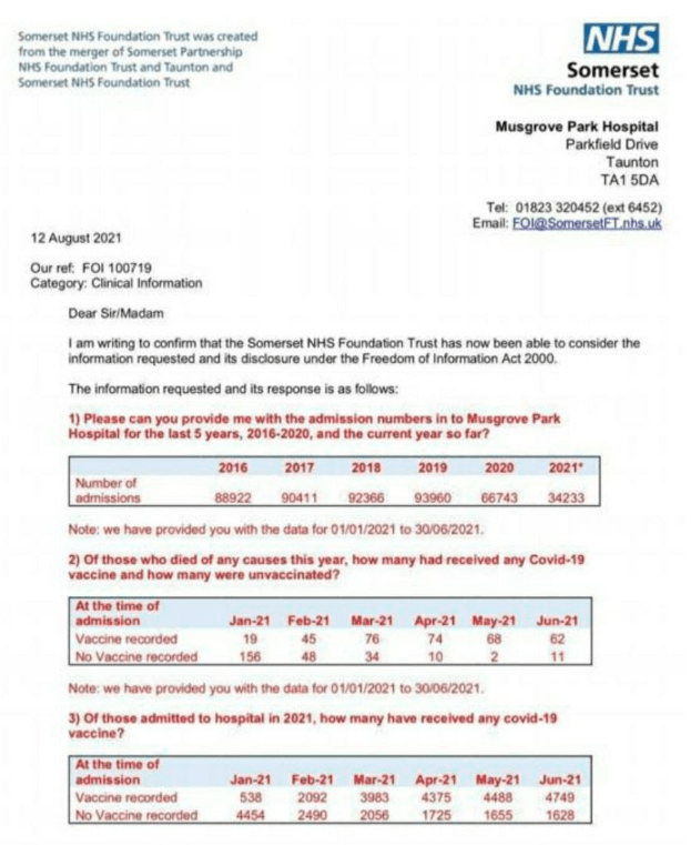

Plot of raw percentage of vaccinated (black) vs un-vaccinated (blue) hospital admissions for the first half of 2021
To get a lay of the land, I first just plotted the data – always a good idea when starting on an unfamiliar data set. Just spend some time looking at it. These are just plots of the raw data, black representing quantities for vaccinated patients, blue, unvaccinated. First, I’m just plotting the percentage of admissions each month; this is just the raw data from the table in point 2 of the letter. On the Y-axis, I’m plotting the number admissions in each category as a percentage of total admissions. Note that the fraction of vaccinated patients grows while the unvaccinnated population falls as the vaccination program begins in January. This is exactly as expected as you draw from an increasingly vaccinated population.

Percentage of all hospital deaths in the vaccinated (black) and un-vaccinated (blue) patients for the first half of 2021.
Next, do a similar plot for all cause mortality (data in item 3 of the letter). In all cause mortality the same pattern is seen, with the fraction of people dying climbing rapidly in the vaccinated group and falling in the unvaccinated group. Again, this is exactly as expected in a population that is increasingly vaccinated regardless of efficacy or safety. I’ve unfortunately seen some commentators confuse, either deliberately or through carelessness (and on both sides), this sort of data by saying things like “the percentage of people dying who are vaccinated exceeds the unvaccinated”, trying to imply that this, in and of itself, indicates an issue with vaccine safety. Of course it doesn’t; without knowing the relative populations, it’s almost meaningless. One needs to know if, as a population, the vaccinated are faring worse in some relevant metric. In fact, the fact that the admissions and mortality plots are almost identical might indicate no or minimal effect on all cause mortality for the vaccines. One needs to look at population normalized numbers to tease out any effect in a multivariate problem like the above, where variables are changing with time.
To correct for the time varying relative populations, I normalized the total death from all causes in each cohort by the fraction of the population in that cohort. This tells you how many people in each cohort died each month per unit population. I’ve multiplied by 10000 here just to get the numbers up to readable. Could just as easily go per 1000 population, but…

Deaths per 10000 people in the vaccinated (black) vs un-vaccinated (blue) patients.
There are 2 things to note. 1) All cause mortality is nearly Identical in January, before the start of a widespread vaccination program. That gives some confidence that we have a measure of the background rate of mortality. One could go to historical data and verify that. 2) While both curves drop, reflecting seasonal variation in all cause mortality, the un-vaccinated curve rapidly falls below the vaccinated curve, indicating that, per capita, i.e. independent of population vaccination rates, the vaccinated cohort are experiencing significantly higher mortality rates and the difference gets larger as a larger fraction of the population is vaccinated. There are of course confounders – it could be that the vaccinated population seeking hospital care is significantly less healthy than the unvaccinated population, though this seem unlikely. In fact, the straight forward explanation is that, while vaccination seems to protect against COVID-19 associated death, safety issues result in overall increased motality. The latter is consistent with analysis of the initial Pharma company data showing worse overall outcomes in the vaccine arm when overall population health is used as a metric as opposed to restricting the metric to only COVID-19 specific outcomes – and even in the trial data, at least, the COVID-19 mortality data were not statistically significant with 1 death in the vaccine arm and 2 in the control group. Note that I don’t mean to imply that the vaccines do not mitigate deaths from COVID-19; they certainly seem to do so even though, given the generally small death risk, the trials were not large enough to generate a statistically significant result there. But I also think there needs to be an analysis of overall population health and mortality to see if one can claim a net benefit from a widespread vaccination program. And of course, none of this says anything about the completely unknown long term safety profile of the vaccines, especially in the regime of continuous boosers.
Are these data an outlier? It would be nice to see this for a wider selection of sources, but those data seem very difficult to come by. It seems like this should be standard data collected and analyzed. While there’s no absolute proof here, it is consistent with the actual trial data, if buried, in the 6 month follow up after EUA. It is possible that vaccine administration will, in and of itself, increase mortality when the metric is not confined to COVID-19 outcomes; seems like something medical professionals and experts should like to know.
BTW, I apologize for slacking on “Is the Universe Getting Biggerer”; writing it has proven more difficult than I thought and I’ve been distracted. I have the “Laster” episode mostly done, but it got pretty long and I think I need to make it into two parts. Promising a “Laster” but always delaying it; sounds familiar.
regarding my likely termination on Dec 8th.
Sorry.
But I also think there needs to be an analysis of overall population health and mortality to see if one can claim a net benefit from a widespread vaccination program.
I doubt that will happen anytime soon, unfortunately.
Interesting read, thanks!
What does “case nightmare kitty” mean?
’Vid sufferers shouldn’t let their guard down when going to sleep near a housecat?
No, that’s true for everyone.
Brah, don’t you even science?
Great start putrid. The age restrictions on the vaccine will likely skew the unvaccinated population to a overall younger and thus overall much healthier age.
A quick way to adjust is to ad age as a factor to minimize this effect.
So compare 20-30, 30-40, and 50-60 year olds within the same data set if it is available.
Very good point. I didn’t find anything on an age break down in this specific data set. One might be able to bootstrap from the historical population mortality broken down by age to get an estimate of mortality rate in broad age cohorts and compare to the relative rates here. Could get pretty tangled pretty quick though without having that data (age breakdown) in this specific data set.
And, if we can continue to get these sorts of data sets released, if the age normalization is the core of the issue, the types of curves in the 3rd figure should merge or cross as we continue, for some reason, to push the vaccine eligible age down and down and down.
I just wrote a comment about this in the last thread. This is exactly what I was looking for. Thanks, and fantastic job as always.
It’s terrible that politics has rendered science completely neutered. This is the type of analysis that should have been ongoing since the start. Maybe someone else in their home office is doing it and we’ll see it in a book 5 years from now.
Nice work. I wish people would wake up and stop this insanity.
Was just looking at these 2 meta-analysis of studies linked by the Gateway Pundit:
64 studies of the effectiveness of Ivermectin.
294 studies on hydroxychloroquine’s effectiveness.
Both effectively banned in many places – because they work. Initially at least, that ban made me more suspicious of the vaccines than the vaccines themselves. What the hell is going on and why am I being stripped of all treatment options?
Because
a) Fauci for some reason loves vaccines and he controls the narrative, and
b) This bit from Google: “On Tuesday, the company announced just how much money the shot is generating. The vaccine brought in $3.5 billion in revenue in the first three months of this year, nearly a quarter of its total revenue, Pfizer reported. The vaccine was, far and away, Pfizer’s biggest source of revenue”
?
“A” is absolutely true. I’m convinced that Fauci is a psychopath with delusions of saving the world with his vaccine efforts. His career is a testament to the goal and his own incredible narcissism.
Agree 100%. Up to now he’s been mostly in charge of warning labels for cigarettes. Now he gets to be a big hero and save the world. You don’t get to the top of a bureaucracy like that with humility and a small ego.
Don’t forget that “Pregnant women should not drink Everclear”
His telling a bunch of kids that he’d gone to the North Pole to vaccinate Santa last Christmas was a glimpse into his narcissistic psyche.
Yup. Everybody wants to be Jonas Salk, until it comes time to do Jonas Salk shit…
Or attend his elementary school alma mater. It’s the worst in The Rockaways and one of the worst in all of NYC. It’s also my kids’ zoned school and we had to fight like Hell to keep them out of it.
Fauci sidelined research into treatment for AIDS for a time – 18 months, two years? – in order to pursue a vaccine. He was heavily criticized, and punished with a promotion. This has been his pattern for some time.
All the rational analysis in the world isn’t going to move the emotional needle that is deciding how so very many people feel about this.
This. I just think about all the people in my FB feed whom I previously thought of as rational who are frothing at the mouth over the vaccine and know there is no way to combat that, especially with dry facts and figures.
I can’t even say, “Fauci was on the cutting edge of HIV–utterly wrongly” without people saying some variation of, “Yeah, but he’s older and wiser now.”
They want to believe. They’re invested in it.
The changing narrative – and the rush of the vaccine – is what gives me pause.
At first it was “getting vaccinated will mean herd immunity and a return to normal.” We weren’t told that the “vaccine” is in fact leaky and had reduced efficacy with time. And that the vaxxed can can still carry the viral load, infecting others both vaxxed and unvaxxed.
After the first narrative, it was “well they aren’t always effective, just add some boosters for the future. And if you do get the ‘rona, well there is less chance you will be hospitalized.” The latter may be true; but given the VAERs reporting, my general good health, and my repeated public exposure in large group with no ::knock on wood:: signs that I ever got COVID-19, then why would I get vaxxed?
That, and the forcible “pushes” from the powers-that-be just sticks in my craw. The vaxxes could be wonder drugs but meh, it doesn’t mean I want any of it.
note: EF and LH Jr both got vaxxed early on and I was about to… but, as the weeks passed I decided against it. At this stage I assume I’m either an asymptomatic, or my natural immunity is high enough that it’s not getting to me. Or else I’m extremely lucky.
I think a lot of it is also another front in the war of Collectivism (one size fits all) vs Individualism (do what’s best for you). We’re seeing that same fight over school choice. In this case Collectivism has a pretty big hammer and they’re using it.
^^ there is a pretty big section in my accommodation request that addresses this. The foundation of ethical medicine has been patient autonomy and informed consent for 50 years. Often it’s framed as “person-centric” medicine. Somehow all that got tossed out the window overnight, and one-size-fits-all assembly line medicine is back in vogue.
The fact that a lot of other countries recognize natural immunity, but none of the mandates in the US mention it, is also telling. I also don’t hear anything in the mandates about people who have had adverse reactions to vaccines, although that’s the first question they ask when you get the shot.
Related
Thar she blows!
Did anybody hear about the hundreds of American schoolkids who died of covid since the start of the school year?
I listen to a bunch of international broadcasters, and one of the guests on South Korea’s English program today was a “public health”-type brought in to bitch that South Korea’s “living with covid” strategy was starting too early and that the population needed to be locked down longer. Said guest was asked about the decision in the US to approve an EUA for Pfizer’s vaccine in children, and he said that at first he was against vaccinating children, until the data from the US of those thousands of cases and hundreds of dead kids because we reopened schools too early.
In local TMITE news, the local TV station last night had a propaganda piece on the decision not to extend the Moderna vaccine to teens that went something on the order of “an FDA committee voted not to approve the extension of the vaccine due to a heart condition you can get as a side effect of getting covid”. No biased reporting there, no sirree.
Well, the pharma industry only spends $4.6B on television ads every year, almost ten percent of the entire tv ad industry.
hundreds of dead kids because we reopened schools too early
Well, schools didn’t reopen until this fall. And the number of kids dead from COVID in the last few months may be in the low dozens, at the most. You have to go all the way back to the beginning of the pandemic to get “hundreds”.
I had to read that quote three times before I caught the switch.
That’s… something else.
Yeah, maybe I should have been clearer. The guest changed his mind on vaccinating children because of all those dead unvaxxed children.
The vaxxes could be wonder drugs but meh, it doesn’t mean I want any of it.
They would sell themselves then.
And it’s snowing,
It snowed twice here yesterday. The kitten was confounded.
How’s the knee(s) doing? Must be OK if you’re hunting/grocery shopping for your gang.
Better every day
Thanks PM,
At first I was sucked in the group, “See I told you so”, then I realized what the charts really reflected but rarely are understood.
Something we already knew. Old people die. Sick people die. Old sick people are going to die, in spite of the government interference.
While Cuomo is certainly guilty of malfeasance of office he’s been taking the rap for the old sick people deaths.
While Cuomo is certainly guilty of malfeasance of office he’s been taking the rap for the old sick people deaths.
We all die eventually, the Grim Reaper remains undefeated. Except perhaps for Pie and some of his countrymen…
Cuomo is responsible for accelerating the timeline of some deaths and should take heat for that.
I should have said “all the old sick people deaths”
And I should have known that was the intent. I’m irritated, my corporate workstation is dead and I don’t know what to do with all this “free” time (not actually free, I have to stay home waiting for a replacement to arrive. Blech.)
We already knew that Covid was hitting the old people hard. They never should have sent sick people to the nursing homes. That was a no-brainer. I can cut some slack to people early on in the pandemic because there was a lot more uncertainty than there is now, but putting sick people in nursing homes was a total fuckup. Cuomo deserves blame for that.
The worst of the Covid-related elder abuse was not allowing their adult sons and daughters to visit them in their final weeks and days.
I am bothered to this day by the case in which an English lady was visiting her Covid-stricken mother, through a glass window, in which the daughter had a phone and the nurse who pushed the wheelchair for the mother had the phone on the other side. The daughter commented to the nurse that her mother didn’t look well, that she looked bluish and needed oxygen.
The nurse just stood there with the phone, and when the daughter pleaded with her to get her some attention, the nurse turned around and pushed the elderly lady in her chair back down the hall. The daughter cried out “Don’t take her! Don’t take my mother away!” smacking her palms against the glass. It was the last time she saw her alive.
Fuck the NHS.
Sarah Palin’s “Death Panels” don’t seem so far-fetched anymore.
The NHS are a bunch of ghouls. That is no exaggeration.
it could be that the vaccinated population seeking hospital care is significantly less healthy than the unvaccinated population, though this seem unlikely
Except that the push in the UK, like here, was to protect the most vulnerable. That the vaccinated are less healthy isn’t unlikely at all.
Less true now, but moreso when this data collection ended. I’d like to see this sort of data released regularly. As near as I can tell, at the start of June of 2021 in the UK (end of this data set), vaccination rates in the 18-39 age bracket were ~25%, 40-49 ~60%, and 50+ ~80%. As of today, 12-15 are approaching 25%, between 16-39 reaching 60%, and above that 75-95%. So this sort of data for the end of this year would be illuminating. The rate over the course of the 6 months of this data in the 18-39 age group of around 25% vs 80% at 50+ might be enough to explain the difference in the curves. Unfortunately, the age distribution is another time varying aspect of this that is difficult to pull out with good data.
“with good data” – “without good data”. Three letters can totally change the meaning of a statement.
The CDC seems very uninterested in collecting good data on COVID and all the therapies right now
Another potential point is the degree of delayed/time shifted deaths, due not just to the vaccine but other changes surrounding covid, into the study period. Eventually those will normalize as well.
I should amend that from likely to plausible.
I did not realize that there had been a couple trials with Quercetin.
What’s All The Buzz About Quercetin?
Here’s the results of the four studies.
https://c19quercetin.com/
I’m so damn sick of hearing about “approved” this or that. I don’t give a watery shit whether the FDA has “approved” anything, they aren’t my Dad, and they have less than zero credibility on anything. The FDA’s stamp on anything makes me question whether I want any part of it. So let’s lay off the “approved by the FDA” bullsh, Mmmmkay?
We are seeing history rewritten in real time.
This is a quote from a Pittsburgh Penguins board I read:
This was in response to the Penguins having players on the COVID list and someone else questioning why we were still scared since we were told the vaccine would prevent infections.
That’s the data I’m not seeing: month by month tallies of vaxxed and unvaxxed as hospital admissions, ICU admissions, and deaths. Preferably, reduced to a rate, rather than a count. The data you do see is obvious garbage, as it goes back too far, to when few people were vaccinated, and is not a rate by cohort of vaxxed or unvaxxed, but just a gross percentage of unvaxxed deaths and occasionally admissions.
Voting was quick and painless… well, the act itself was, the results, likely not so much. The check in was digital for the first time. In previous elections, they look up my name in a big book and I sign next to it. Today, it was done an ultra-secure, in-no-way-vulnerable-to-hacking iPad. We had Libertarian candidate for but I couldn’t bring myself to vote for her and her Park Slope Compassionate Liberaltarianism. There was Libertarian candidate for Comptroller who lost me when he said his number one priority is shoring up the city’s pension system. There were also several city council incumbents running unopposed but representing both Democrat and Republican parties simultaneously.
I just got back from the polling place. They rolled out the digital sign-in a few years back here.
Almost no races, a few judges, most unopposed. I voted against the vile constitutional amendments they’re trying to sneak through on this off-off year.
And I was only the 69th public ballot recorded today.
There were over 6k private ballots recorded. I wonder how many will be transformed after the station closes.
A Constitutional Right to clean air, water, and land. There’s no way that would ever be abused.
I predict that one will get at least 80% of the vote. I mean, it’s just common sense, duh.
There were seven open positions and six parties. No L’s. I decided against the “Moving Milton Forward” party as being code word for “progress” and the “United Milton” party as being too collectivist. So I wrote in STEVE SMITH, Banginglc1, Semi-bright Border Collie, Zombie Almanian, myself (for judge), Calvin Coolidge, and John McAffey.
And no on the constitutional amendments.
I can’t figure out why we used to get voting results the same day, or occasionally the next day, when every ballot was cast on one day. Now that they trickle in over time, it somehow takes longer to get results?
Pimpin’cheatin’ ain’t easy.There was only one contested race here.
There were also poll workers who didn’t recognize me, unlike every year in the past.
Interesting. Thanks, PM.
One thought I had about a potential confounder would be the possibility that, after receiving the vaccination, people who had been severely concerned about contracting COVID may have relaxed their self imposed isolation, in the process exposing themselves to more risk overall from infection with other diseases or even accidental causes. Does the data indicate the causes of death?
COVID is the only cause of death, comrade.
What was really confounding (or not) is there was a considerable spike in mortality in the UK btw injection 1 and injection 2 for those in Assist homes (old and vulnerable). Some didn’t get injection 2, so they were counted as un-vaxx. There was the speculation that the 1st inject made old more vulnerable to infection.
No cause of death I could find. That’s a huge part of the problem, fragmented unreliable data. So one’s left scrounging for what they can find, and then retard’s like me can come in an do a hack job on it and pull out what might be misleading conclusions. My suspicion is that the age confounder from Gustave is much more likely to skew this data set, maybe enough to show a benefit from vaccines, though given other signals from different data sets, including the EUA studies, makes me doubt it – but it’s certainly plausible. My thought would be that it would be tough to generate enough new COVID deaths from change of behavior in the vaccine group to make up the difference see there.
I wish we could rely on the people tasked with doing these sorts of analyses to do them accurately and transparently.
Transparency is in short supply these days but thanks for taking a stab at it.
Don’t you mean taking a jab at it?
/ducking
*Wanders in whistling, looks around, wanders off*
The first six months of vaccination is probably too early to learn much. The vaccines were in limited supply, and vaccination was focussed on the highest risk population.
Mass vaccination of the whole population didn’t start until the second half of the year.
You really need some kind of age break down. It is clear that the threat of COVID is closely tied to the combination of age and comorbities and the risks of the vaccine are also closely tied to age. COVID is a real threat for old people. And the vaccine is a real threat to young people. This is why the mandates are both morally/ethically wrong and counterproductive and the same time.
The real question is whether early treatment with therapeutics is more effective than vaccination, particularly over the long-term when vaccination becomes useless or worse.
The CDC and the NIH refuse to even address that question.
“COVID is a real threat for old people.”
So is the calendar.
The real question is whether early treatment with therapeutics is more effective than vaccination,
Why not both.
I mentioned the other day. This will be like influenza. In at good year, the flu shot is 70-80% effective at prevent the flu or reducing the impact of the flu. In a bad year, it’s only 30-40% effective. But we also have tamiflu (which worked wonders the two times I needed it).
So high risk population gets the shot. If you’re unfortunate enough to get the disease, then you take the therapeutic drugs.
If not in a high risk population, skip the shot. If you get the disease, take the therapy.
Why not both.
Because personally I have just way too many questions about the safety profile of the vaccines. There seems to be a strong signal of significant, severe effects in overall health outside of COVID. The concerted effort to quash any inquiry about that and make it unacceptable to question simply strengthens my sense that something is amiss.
I may be entirely wrong and there are minimal short term adverse affects, as we are continuously told, and there will be no long slow burn of population level harm in the long run that will be difficult to tie directly to the vaccination program (much like the rise in metabolic dysfunction since the 50’s and 60’s following attempts to ‘fix’ our nutrition). Weighted against the overhyped danger of COVID, it’s not a wager I’m willing to take.
Lest that come off as dismissive of those who take the vaccine, it’s not my intent. If one evaluates the relative risks differently or has more trust in experts and institutions than I do at this point (my bias is always to be contradictory to those who presume power, so I always have to be careful to try and be objective, though I don’t always succeed), have at it, whatever multi-pronged approach you wish to pursue and I sincerely hope it works out the best and I’m just a pathological psycho who see goblins where there are none.
^^ cosigned.
cosecanted
cotangented
*hops on bandwagon*
There seems to be a strong signal of significant, severe effects in overall health outside of COVID.
Where is the data?
I am totally onboard with it being a dumb idea to vaccinate anyone under 40 or 50 years old. We have no idea what the long term effects are going to be in a few decades.
In the hearings on Pfizer boosters, the FDA said (and included in their presentation) that the risk to men under 40 was less from the disease than from the vaccine causing cardiomyopathy.
See the last link – a paper the Ozy put up a couple of months ago. That’s from follow up on the original studies in the EUA applications. One has to dig through the studies as the pharma companies aren’t putting it out there in an easy to find form. There were something like 20 deaths in the vaccine arm vs. 14 in the control group, where I’ve put 2 that happened after unblinding and people in the control getting shots (a single dose in one case, full 2 doses in the other) from the control into the vaccine. Statistically significant? Maybe not. But the mortality in the vaccine arm skewed towards heart issues, above the background rate expected. But at least it wasn’t COVID. The signal in VAERS. Anecdotal reports from doctors. Multiple small papers published in blogs. I don’t like internet science, but when the institutions seem hell bent on quashing discourse in favor of a narrative, that’s how it has to be done. Of course I could unknowingly have transitioned into the land of the whackadoodles and am suffering confirmation bias and all is well with the world.
and I sincerely hope it works out the best
QFT. Amen.
That’s gonna leave a mark.
https://babylonbee.com/news/kaepernick-mad-that-no-slave-owner-will-enslave-him-no-matter-how-many-times-he-tries-out-to-be-a-slave
LOL and as usual perfectly accurate take
He was good for a couple of years till every defense figured out his shit and then he was riding the bench until he was too poisonous for a team to have him on board. I didn’t live during slavery so I may be wrong, but I thought slavery was basically not having any options to leave and doing the work without getting paid.
Fuck him with a rusty spoon.
I like how some people act like he was some future Hall of Famer who got fired because of his political views – as you said, he was benched and he opted out of his contract with 4 years remaining.
He had plenty of chances to play in the NFL after SF but he thought he was worth more than what his capabilities were on the field. And on top of him being the poster boy for the SJW, he was just too much trouble for any team to take on.
Primadonnas at QB are a dime a dozen.
PM, just wanted to say thanks for this. Very well written and objective. As much as I want to find stuff that justifies my biases, I think it’s even more important to have objective data (as much as possible) and let people make their own conclusions. You’ve done a great job of that.
I wish I knew what else to say about all this. It seems like everything has been said. I don’t know how much more discussion and debate can be had, and maybe that’s why the divide between people seems so insurmountable.
I watch a lot of YouTube videos on my TV – and, given that I’m too cheap to subscribe, I get a lot of repetitious commercials for the COVID vaccine.
One of them is drilled in my brain:
Which begs the question – if they are so sick that they have to be put on life support, how can they make that phone call?
The Psychic Phone Network.
Miss Cleo knows Ya future!
I see a lot of patients coming in with severe disease.
Bullshit. Unless Karen works in an ICU in a major hospital, she ain’t seeing “a lot” of patients that need to be put on life support because of COVID. On any given day, we probably have, in our 600 bed hospital, 6 or 7 COVID patients on “life support” (a term nobody uses, BTW). That means maybe, at most, one new one a day.
Speaking of terms nobody uses, does anybody use the term “safe staffing levels”? Every time the local news is parroting nurses’ union propaganda, the presstitutes use that term.
It comes up, but the industry jargon is “ratios”, as in the ratio of RNs to patients. In an ICU, it is typically required to be 2 or 3 (depending on where you are) patients for every nurse. On a regular unit, it can be more like 5.
“Friendly reminder: Covid isn’t over just because we’re over it! Especially for the kiddos who are too little for masks and vax. Liam will be home for the next two weeks due to a classmate testing positive. ‘Luckily’ I already lost my job a few months ago so I’m available to care for him. We’re keeping our fingers crossed for negative results. In the meantime keep masking and vaxing and staying safe!”
This was written by an acquaintance on FB.
“Friendly reminder – small children are at so little risk from the disease that you should be more afraid of the masks and the vax.”
And also friendly reminder, I’m not giving my kid some experimental shot to satisfy your thirst for control and soothe your fears.
Narrator: “Covid is actually over.”
It’s done. It’s just panicdoomporn at this point.
It was over by the time it was announced as a pandemic.
My subdivision had a block party this past August and when I told one of my friends, they damn near lost their minds. I responded that no one is going to stay locked in their homes forever or avoid contact with other people. At some point we have to accept that COVID is here to stay and live our lives as normally as we can.
?Fuck off commie *clap* *clap* *clap-clap* *clap*?
I don’t even respond to these sorts anymore because they are going to believe whatever they want to believe and I’m going to disregard their oracle, Fauci.
This shit… I can’t even.
It’s nothing more than an apparently very successful attempt to get the plebes to hate the unclean.
Two weeks, make it three. 14 days after exposure is too much a risk.
Screw that… at least 2-3 years of unsullied quarantining in a plastic bubble. Then we let you get a breath of dirty air before we lock you away for another year.
‘Luckily’ I already lost my job a few months ago so I’m available to care for him.
No one is hiring right now.
I don’t say it often, but KDW is absolutely dead wrong.
The prestige is only transferable if we ALLOW it to be. The whole fight right now is not to recapture institutions that have pissed all of their credibility into the toilet. It is to simply realize how discredited they have become under Democrat/progressive rule and move on from them. You want to resurrect the skin suit, ok, go ahead. I’m just going to live my life without taking into account their hollow pronouncements.
It is transferable. Which is what makes it such a powerful tool. I think it’s a tremendous evolutionary advantage that humans can defer to experts and institutions; it allows specialization and frees up resources to be spent in other areas. As long as experts and institutions are minimally corrupt. What we are seeing is that the experts and institutions have been corrupt for some time now and it’s only now becoming obvious or at least of such a scale so as to be un-ignorable, at least to us fringe lunatics. But as long as it’s only dawning on a fraction of the population, that science cache of respectability and objectivity is transferable to buttressing the worst sort of social and political systems. It will be transferable until is suddenly isn’t. The last 2 years at least (but going back decades with global warming) have spread the corruption deeply enough – or made an existing corruption visible enough – that the transferability is waning, but it still has a lot of influence on most people.
Scientist everywhere, regardless of political persuasion, should be pissed.
It will be transferable until is suddenly isn’t.
Yes, I am saying that we passed that point. We aren’t talking present and future transferability. The terminally gullible are all that is left for them.
Really? I say it after reading about 50% of his articles.
OT: omg yall, I’m at a glenn youngkin event RIGHT NOW and you won’t believe what is happening
Northam is on Team Youngkin?
I guess this is where that memes from.
There were also the Tiki Torch DemOps folks posing by a Youngkin bus before that.
What’s with the Saints helmet?
Folks from the Lincoln Project showed up to molest the youths at the rally?
L.G.B.
DEA agent charged in MAGA riot tells Tucker Carlson an FBI informant urged him to break into the Capitol: The Army veteran faces 15 years prison despite never entering the building
This is one weird timeline.
Tucker Carlson is the new Alex Jones and he is spreading the same dangerous conspiracy theories that led to the January 6 insurrection.
Did I do that right, CNN?
Your Trump denunciation was insufficiently vigorous.
Yes, you quoted someone’s tweet in there almost verbatim.
Tucker’s pissing off all the right people so that tells me he’s probably on to something.
What did he do exactly and what is he being charged with?
Lèse-majesté
Best I could find “was arrested Tuesday and charged with four crimes that include making a false statement and carrying a firearm on restricted grounds.”
Another possibility that needs to adjusted for: age.
As the older are more likely to have been vaccinated, that could be the primary cause of the all-death mortality being higher amongst the vaccinated. In fact, I would be willing to bet it is all or most of the difference.
What would be interesting would be the age adjusted breakdowns, to see if the vaccinated helps or hurts, and which age brackets it helps or hurts.
I had not read comment #4 when I posted, but what he said.
It’s OK; nobody reads the comments.
https://www.msn.com/en-us/money/markets/from-boeing-to-mercedes-a-u-s-worker-rebellion-swells-over-vaccine-mandates/ar-AAQdR9K
We are not alone in questioning the mandates and efficacy of the “vaccines.”
Lol, wut?
So the obvious answer is to inject yourself with genetic material that causes your body to produce the cytotoxic spike protein which causes the vascular damage and erectile dysfunction.
erectile dysfunction.
I haven’t seen any reports of ED caused by the vaccine. Is this speculation? Or have I missed some actually reporting?
I’m extrapolating on the data which shows that the spike protein by itself causes vascular damage and the mRNA shots hijack your cells to create spike proteins. This is in addition to the mRNA material not staying in the shoulder and dispersing throughout the body.
We know the mechanisms for damage from the “vaccines.” We have data that correlates with that mechanism. Yet everyone in authority refuses to acknowledge what is painfully evident.
From the Salk Institute on the toxicity of the spike protein – https://www.salk.edu/news-release/the-novel-coronavirus-spike-protein-plays-additional-key-role-in-illness/
Pfizer’s own data on the bio-distribution problem.
https://www.civilianintelligencenetwork.ca/2021/06/18/confidential-pfizer-document-exposed-vaccine-is-toxic/
spike protein by itself causes vascular damage
I accept that that has been shown.
I am not ready to extrapolate to what the downstream effects of that are or will be.
I would wager that the evidence for ED after vaccination is probably just as good as whatever data they pulled out of their ass for their claim of ED after COVID.
In general, I think the vaccines are poison. It’s my opinion, but Steve Kirsch’s analysis is worth reading. And unlike most he actually shows his calculations.
https://www.skirsch.com/covid/VCage.pdf
The money shot:
Six times more likely?
Huh.
I guess the odds were in my favor this time as I had Covid and everything still works.
The humorous two-minute vax promo, hashtagged “#SaveTheFutureBoners,” begins with Meadows and other male actors reminiscing about the first time they got it up, as well as the fun times they had with their no-longer private parts.
As I understand the clot shot is not good for blood flow.
Are we sure this isn’t a deep-cover Bee production?
I’m not sure the entirety of the last two years isn’t a deep-cover Bee production. Hell, five years.
The Critical Drinker knocks it out of the park.
https://www.youtube.com/watch?v=CQ92cggLMx8
Voting complete – 2 write-ins (mayor and my worthless alderman), the rest ‘none of the above’.
The choices ran the gamut from hard-left Democrat to far-left Democratic Socialists of America.
This city is going to get it gooder and harder.
I voted by mail because I didn’t plan to be at home today. And yet I’m here today.
Seen in Richmond.
I was putting together another glibs DIY article like I did back a few years back, this one focused on triaging error codes on the car. This one comes with some extra “project goes sideways” fun as the car jack splurted all its fluid on the garage floor when I tried to pump it.
Any recommendations for a high quality hydraulic jack?
a high quality hydraulic jack
Are we still not doing phrasing?
Well given the up-thread discussion about ED wrt COVID and/or the vaccine.
You could turn it into another post about replacing the seals and refurbing the jack….
Also, always use [good quality, avoid recalled HF] jackstands.
Gustave is spot on about the jackstands.
Most of the hydraulic cylinders in consumer grade (and even commercial) floor jacks are Chinese or Indian crap these days. Blown seals are a constant problem.
Get your jack at Northern, but always use heavy jackstands for safety.
If it wasn’t a HF piece of shit that failed in under a year, I’d be tempted.
Jack stands are absolutely a must. I was half-entertaining the idea of just sneaking under there without them to do the quick car repair. That was about 5 seconds before the jack blew its load all over the floor.
Never trust a fart or a hydraulic jack.
Never cheap out on jacks or jackstands.
And you are correct about trusting them.
How far do you want to lift the vehicle?
I bought an Arcan HJ3000 at Costco for like $100 and it has been bulletproof. This was back in 2016 so I’m sure it’s way more expensive now.
Great jack, though.
I have a 3 ton Craftsman that I bought in 2004 that’s still going strong, but I don’t know if newer Craftsman are that good.
One of the reasons I stopped doing engine swaps and big car repairs was I HATE getting underneath a car; even with jacks and jackstands.
The sound of a leaf going by was enough to make me flinch, especially when you’re doing something underneath that requires a lot of torque.
^This^
A few years ago I was getting a “lean engine bank” code in a BMW 325i
I looked up the code, and got the suggestions for what the usual suspects were. Usually a vacuum leak somewhere.
Replaced the upper intake tube, which had some holes in it. Code came back after a CPU reset.
Replaced the lower intake tube which was also rotting. Code came back.
Cleaned MAF – code came back.
Replaced MAF – code came back.
Replaced oil line; thinking it was broken and causing a vacuum leak. Code came back.
Long story short – the flapper to switch between the long and the short runner parts of the intake was no longer working. it was stuck permanently in short runner mode. There was no vacuum leak.
I learned to hate BMW though 😉 Their plastic is designed to wear out.
Thanks so much for doing these PM. I don’t know how you have the patience. It seems like very few people are interested in good data, so to be able to tease anything worthwhile out of the tangle is impressive.
I have little faith that we will ever know the truth about the real harms of these vaccines. As others have mentioned, the overall metabolic disorder of our population makes it really challenging to know what exactly is killing people.
I don’t think any of my peer managers are willing to stand up against our boss. I am, even before all of covid nonsense. We schedule work at night because shit happens and we would rather shot happen when there are no planes, than when we are departing/arriving 60+ an hour.
This little micromanagement twit decides that our work isn’t that impactful so just do it during the day. So…fine. I made my objections in writing and we will schedule for daytime and if it goes sideways, I will toss it right at her feet.
This has been a great day
LOL, I snarked on a MacAuliffe Derpbook ad in the comments and got a personal message from his campaign with a request for some question answering.
Hey, how’s the neighbor drama going?
The attorneys spoke today. I don’t know how it went.
I do know the vultures are physically isolating the neighbor from everyone. We’ve received complaints from others in the neighborhood who have been thrown off the property when trying to visit. Told them to report it to the social worker.
I don’t expect the neighbor is going to survive very long at this rate and I fully expect the vultures are going to pick her clean. It’s really a sad statement on how shitty people can be.
physically isolating the neighbor from everyone
A massive red flag for elder abuse. Sad.
I suspect that the fact you have lawyered up makes you a “hard target” for the vultures, and they won’t be trying to come after you.
semi-related
My grandfather and grandmother once inherited an entire house from an elderly couple. This was back in the 1960s, mind you. But it was with the understanding that their special needs son could live there and my GPs would only get the house when the son passed on.
And whattya know? My grandfather died but my grandmother lived on to take care of the special needs kid, and to make sure his bills were paid and the house looked after.
That’s how things were done back then… I guess. There may have been some lawyers involved but I doubt it. I’m sure there would be some people who would take advantage of such a situation.
I really hate thieves and taking advantage of an elderly widow is just beyond the pale.
We really tried to help her get set up so she would have a chance at some comfort, but now she’s going to die while living in constant fear and paranoia, egged on by her poor choice in friends.
I wasn’t really fond of CHKD before. Now I really don’t like them.
https://www.chkd.org/uploadedFiles/Documents/COVID-19/COVIDTownHall_9.15.pdf
“Despite vocal opposition from some, vaccine mandates have been effective at shrinking the rates of the unvaccinated ”
No shit. If 40% aren’t vaccinated and you fire them then the rate of vaccinated goes up to 100%.
I heard that dunce Biden bragging about his mandate being wildly effective at increasing the % of vaccinated. He had no idea what he was saying.
Fuck Poopie Joe.
DIVOC has a chart that shows vaccination and new fully vaccinated (its an option on their main chart). “New fully vaccinated” has been in a nosedive since early May, with a couple of blips in July and September. Looking at teh total vaccinated chart, the total vaccinated count has been increasing very slowly since June.
To be fair, as the number vaccinated goes up, the number of new fully vaccinated is going to go down. Still, its hard to call those charts a rousing success for the pro-vaxxers.